
Would you rather: Read Harvard Law Review, or a finance website?
This blog is brought to you by Emma Ninham, Account Executive, MAVERICK
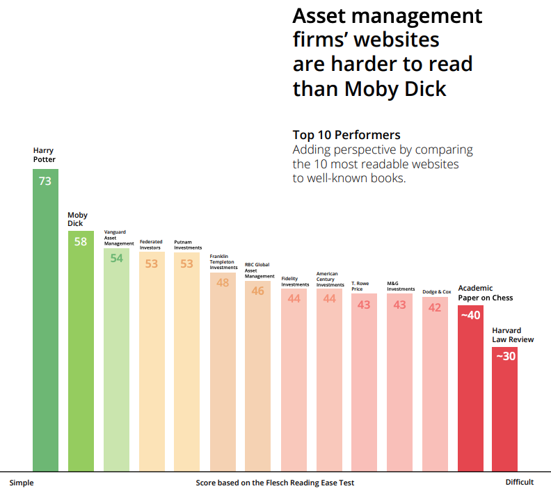
A trending post on LinkedIn recently caught my eye: Finance companies’ websites are more difficult to read than Herman Melville’s 1851 novel, Moby Dick. An intriguing and unique comparison to say the least.
The Clarity Index, a new report by VisibleThread, found websites of investment firms have low readability, long sentences, high complex word density and overuse the passive voice. The study implemented the Flesch Reading Ease Test to analyse the transparency of 60 top Asset Management firms’ websites.
The higher the score on the test, the easier the content is to understand. For example, plain English (easily understood by 13-15 year olds) is graded at 60. Harry Potter is 73 and Moby Dick is 58. The average finance website, however, is 37 - not far ahead of the hefty Harvard Law Review at 30.
This had me thinking about the user experience of other websites – fittingly considering MAVERICK’s recent facelift. Fortunately, I don’t ponder through investment websites often (okay, ever), but I do know which websites I like and which I don’t, what works well and what doesn’t.
While it must be noted companies in the finance space have their hands tied by countless rules and regulations meaning they can’t use specific verbiage to promote or sell their services, there are still ways, in addition to rhetoric, to improve website accessibility.
Here are some tips for websites across all industries:
3-click-rule: Websites should be easy to navigate. If it takes a user more than three clicks to find what they’re looking for, they’ll be hitting the ‘X’ in the top right corner before you know it.
Active voice is critical: The passive voice makes for passive readers. The active voice is more direct and concise. In honour of our VP Terance Brouse, “Words Matter”.
Know your audience: A piece of advice that is overquoted but still underused. Think who do you want to be reading your content. If your main audience is not an expert in your industry, write with that in mind.
Simplify the design: A website that is quick and smooth, triumphs one that is overly elaborate and subsequently sluggish. Often, simple is best. And don’t forget to check how it appears on a mobile device!
SEO is king: We all want to be the #1 hit on Google but alas, sometimes somewhere on page one will suffice. Use the most relevant keywords to your audience and keep them coming.
Social media marketing: Another great bonus to the ‘rise of social media’ cliché is the traffic it can help drive to your website. By creating engaging, regular content on social (that matches the style and language of your website), users get a taste of what you can offer. If they like it, they’ll be more likely to head to your website.
Now to bring all this home to the world of public relations. A user-friendly, sleek and simple (yet still characterful) website is vital to sustaining and progressing business. Look at it as the home base of PR capabilities - a digital roof to exhibit storytelling prowess, media relations triumph and overall, award-winning success.